The Chop Shop This section is for display of photo editing work, and requests for photo editing, sigs and avatars, etc.

My signature

  #1  
Old 06-09-2009, 09:20 PM
zeedeevil21's Avatar
Beginning Member
Thread Starter
Join Date: Mar 2009
Posts: 24
zeedeevil21 is on a distinguished road
Default My signature

My first try...What u guys think? What should i add or change?

 
  #2  
Old 06-09-2009, 09:44 PM
TripleBlackBlazer's Avatar
BF Veteran
Join Date: Feb 2007
Posts: 3,335
TripleBlackBlazer has a reputation beyond reputeTripleBlackBlazer has a reputation beyond reputeTripleBlackBlazer has a reputation beyond reputeTripleBlackBlazer has a reputation beyond reputeTripleBlackBlazer has a reputation beyond reputeTripleBlackBlazer has a reputation beyond reputeTripleBlackBlazer has a reputation beyond reputeTripleBlackBlazer has a reputation beyond reputeTripleBlackBlazer has a reputation beyond reputeTripleBlackBlazer has a reputation beyond reputeTripleBlackBlazer has a reputation beyond repute
Default

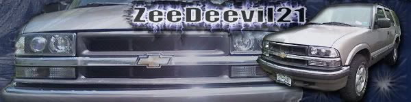
Not bad. Username doesn't stick out enough IMHO. Maybe a different color/thicker font? Edges around the truck on the right are a little rough. What program are you using?

Don't use my sig as an example, I have a tendency to put more work into things for others and much less into things for myself. LOL
 
  #3  
Old 06-09-2009, 09:53 PM
zeedeevil21's Avatar
Beginning Member
Thread Starter
Join Date: Mar 2009
Posts: 24
zeedeevil21 is on a distinguished road
Default

I using photoshop7....i thought the same about the truck..hard to use the erase tool so close to the truck and a get good turnout..ill be working on some ...along with the name, just wanted opinions. i see so many neat ones on here and i just a beginner with photoshop..thanks for the input.
 
  #4  
Old 06-10-2009, 07:01 AM
Sisk's Avatar
BF Veteran
Join Date: May 2009
Location: Halifax, NS, Canada
Posts: 4,772
Sisk has a brilliant futureSisk has a brilliant futureSisk has a brilliant futureSisk has a brilliant futureSisk has a brilliant futureSisk has a brilliant futureSisk has a brilliant futureSisk has a brilliant futureSisk has a brilliant futureSisk has a brilliant futureSisk has a brilliant future
Default

Not bad for your first time! I agree with the font though..I'm not a big fan, it doesn't pop enough.
You might also want to use the "blend" brush and smooth out the edges on your truck.
 
  #5  
Old 06-10-2009, 07:50 AM
oktain's Avatar
BF Veteran
Join Date: Aug 2008
Location: Sudbury, ON, Canada
Posts: 3,209
oktain has a brilliant futureoktain has a brilliant futureoktain has a brilliant futureoktain has a brilliant futureoktain has a brilliant futureoktain has a brilliant futureoktain has a brilliant futureoktain has a brilliant futureoktain has a brilliant futureoktain has a brilliant futureoktain has a brilliant future
Default

I personally use polygon lasso when I cut things out in photoshop with a 5 pixel feather, works good and ends up looking good.
I turn up the transparency on all the layers too so the background kind of shows through, just helps in blending everytyhing together I find. (I might have gotten a little carried away with my Blazer in this one though, it's pretty faint.)
btw, nice font SISK, Did you get it where I think you did?
 
  #6  
Old 06-10-2009, 08:32 AM
Sisk's Avatar
BF Veteran
Join Date: May 2009
Location: Halifax, NS, Canada
Posts: 4,772
Sisk has a brilliant futureSisk has a brilliant futureSisk has a brilliant futureSisk has a brilliant futureSisk has a brilliant futureSisk has a brilliant futureSisk has a brilliant futureSisk has a brilliant futureSisk has a brilliant futureSisk has a brilliant futureSisk has a brilliant future
Default

I agree with the opacity/fading oktain...I also turn the opacity down a notch..it blends better IMO.
And I got this font from a general free font website...I can't remember which one. I'll look for it though and post a link.
 
  #7  
Old 06-10-2009, 03:40 PM
zeedeevil21's Avatar
Beginning Member
Thread Starter
Join Date: Mar 2009
Posts: 24
zeedeevil21 is on a distinguished road
Default

thanks for the feedback....i am looking into trying to find new font ideas to use
 
  #8  
Old 06-10-2009, 09:41 PM
ABN31B's Avatar
BF Veteran
Join Date: Jan 2009
Location: Tacoma-ish
Posts: 3,545
ABN31B is on a distinguished road
Default

zeedeevil21, I like your design. It shows your truck in a nice presentation way, and draws attention to your headlights.
I also agree that the font seems out of place though. Wrong color/feel, and too slim.

One more thing, is that a zombie or the Wishmaster on the far left? Looks like an eye by the passenger headlight...
 
  #9  
Old 06-11-2009, 12:49 AM
zeedeevil21's Avatar
Beginning Member
Thread Starter
Join Date: Mar 2009
Posts: 24
zeedeevil21 is on a distinguished road
Default

now that i look at it...it does look like an eye...weird. Its just the background i used. I still messin with fonts...what color or type? someone want to do one up for me?


  #10  
Old 06-11-2009, 01:10 AM
kiwiblazer's Avatar
BF Veteran
Join Date: Mar 2008
Location: Auckland, New Zealand
Posts: 3,286
kiwiblazer is on a distinguished road
Default

You need a different font. By the way it seems your lights don't fit properly.
 

Last edited by kiwiblazer; 06-11-2009 at 01:11 AM. Reason: spelling

Thread Tools
Search this Thread
Quick Reply: My signature


All times are GMT -5. The time now is 01:55 PM.