Sigs by Red 96'
#1
 01-19-2011, 02:13 PM


Hey guys,
I've been screwing around with Photoshop lately and have made a few sigs for people here on the forum. I figure this will be a good way to enhance my skills while helping a few fellow Blazer drivers out!
Just give me some pictures and a description of what you think you want the sig to look like and any text you might want to include and I'll see what I can do. I do not yet know how to create animated sigs, sorry! lol.

#3
01-19-2011, 07:14 PM
if you wouldnt mind makin me one that would be awsome
use any design you think would look cool with some of these
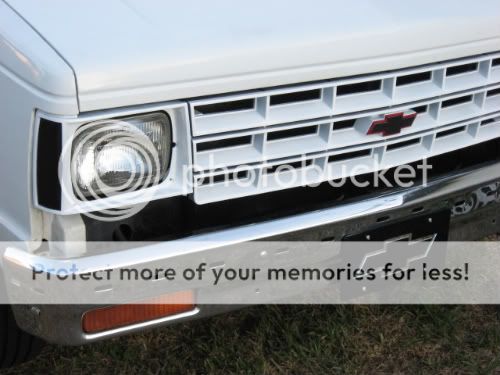
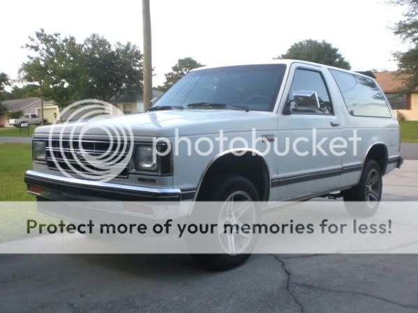


if those last two dont work for ya just use somthin close lol
THANKS
use any design you think would look cool with some of these
if those last two dont work for ya just use somthin close lol
THANKS
#4
01-19-2011, 09:20 PM
Ok, WHITE LIGHTNING, this is what I've got so far. Let me know what you want in the way of text and tell me about any changes you may want me to make!
EDIT: sig removed
EDIT: sig removed
Last edited by Red 96'; 01-23-2011 at 10:57 PM.
